Aria: Designing a blood Sugar tracking app
As a Designlab UX Academy student, I was tasked with the design of a healthcare mobile app. Diabetes (type 1 and 2) is a chronic condition that affects 4.7 million people in the UK alone and it's a diagnosis that can be life altering. However, the condition is also exciting in terms of technology and medical innovation. I looked into the use of technology in order to help sufferers manage the condition.
ROLE:
Strategy, Research, UX Design, UI Design
MENTOR:
PROJECT SCOPE & TOOLS:
80 hours: Pen & paper, Sketch, Framer X
Phase 1: Discover
Contextual Enquiry / User Interview
Diabetes is a complex condition and is very difficult to manage. I set out to understand what living with the chronic condition actually entails and the potential opportunities for a product aiming to help manage the disease.
Before any kind of secondary research, I felt that it was important to sit down and talk to someone who deals with the realities of diabetes management. I conducted a contextual enquiry with a young professional who has lived with diabetes for a number of years.
Through a detailed contextual enquiry, I discovered that the participant uses a flash glucose monitor to measure blood levels throughout the day. She demonstrated how she taps the sensor on her upper arm with her mobile which then automatically picks up her blood level reading with NFC. The participant then showed me the blood level tracking app that she uses and we discussed the app and her condition in detail.
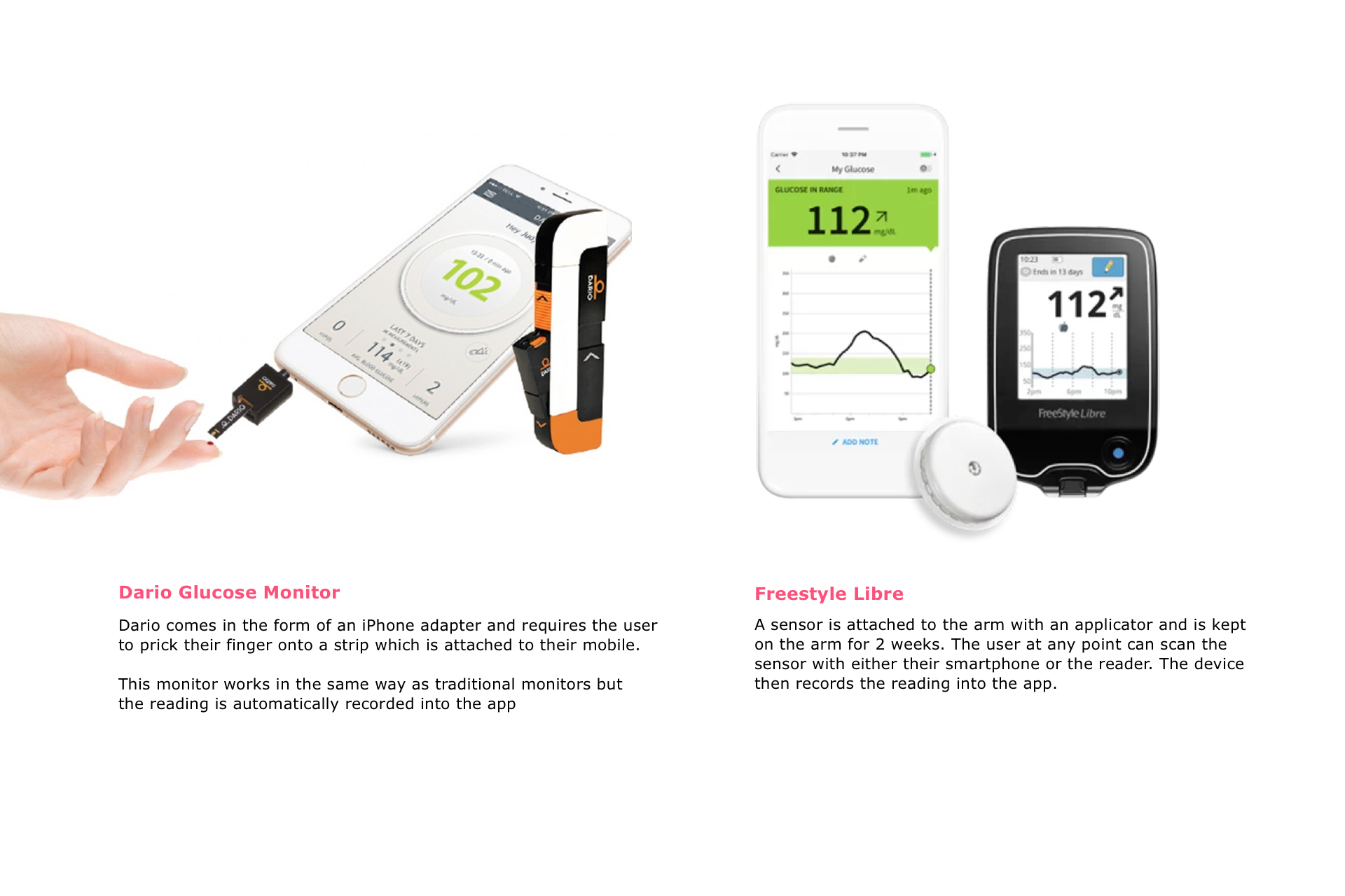
Secondary Research / Competitor Analysis
I then looked into various glucose monitors and diabetes treatments, considering the benefits and problems with each.
Phase 2: Define
UX Strategy Bluebrint
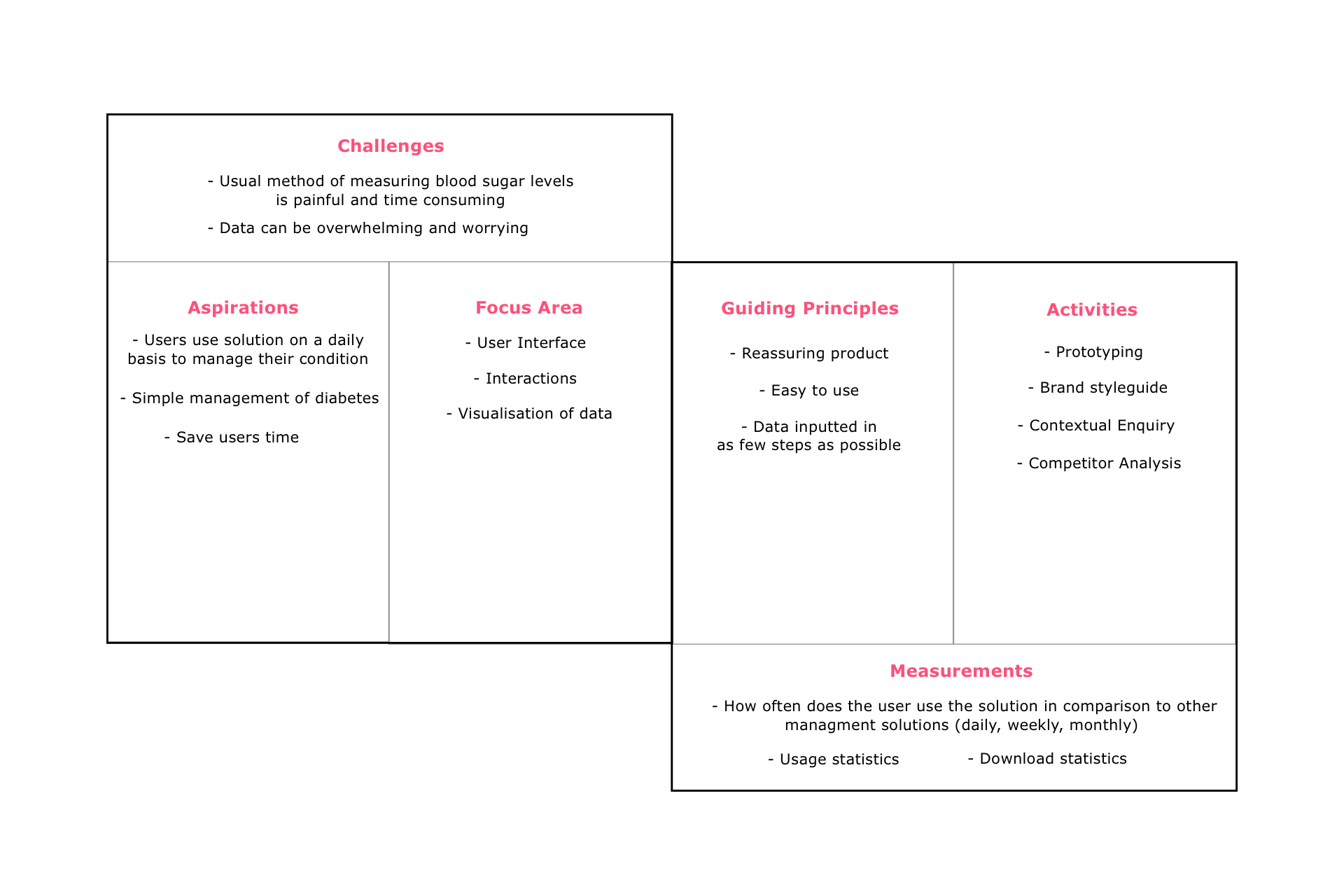
The strategy was vital for designing a successful and relevant iPhone app. I considered the challenges I would face as well as the positioning of the product.
How might we statement
I wrote a 'how might we statement' which was specific enough to be relevant but broad enough to allow for creative freedom.
How might we help diabetics on a daily basis to manage their blood sugar levels with ease and confidence?
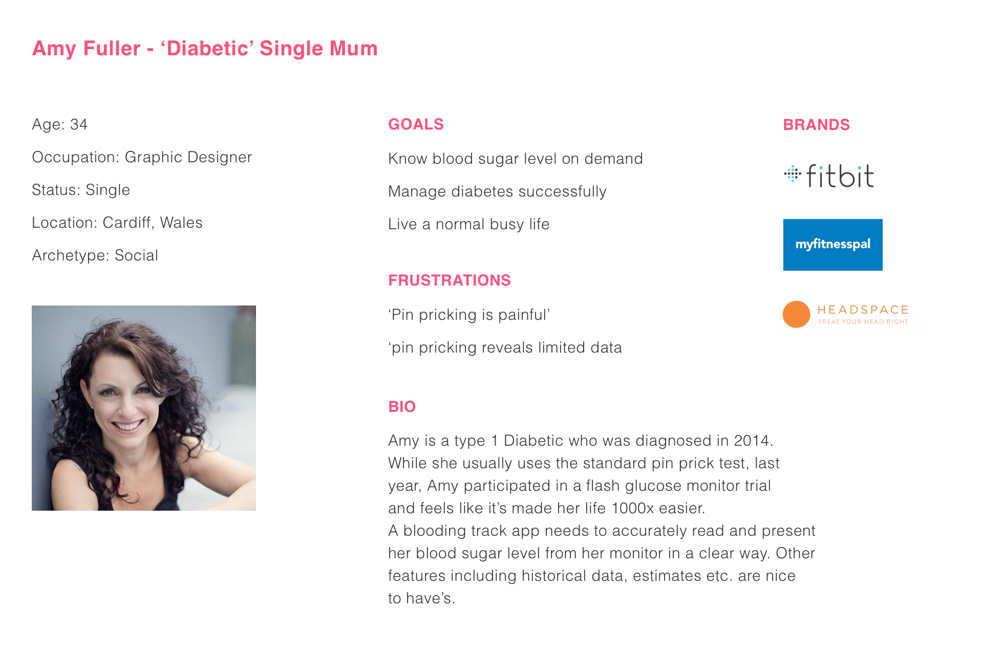
User Persona
I then set out our ideal user, focusing in on the frustrations of diabetes and complex management tools.
Phase 3: Design
Ideation
In keeping with the brief and how might we statement, I set out to design a Diabetes management app which was both reassuring and easy to use. It was important that a potential user felt that the product was accessible to them and was something they could use on a daily basis with ease.
Before ideating, I considered the research that I had conducted. Who was I targeting? What would make the product useful for that audience? What would make the product easy to use?
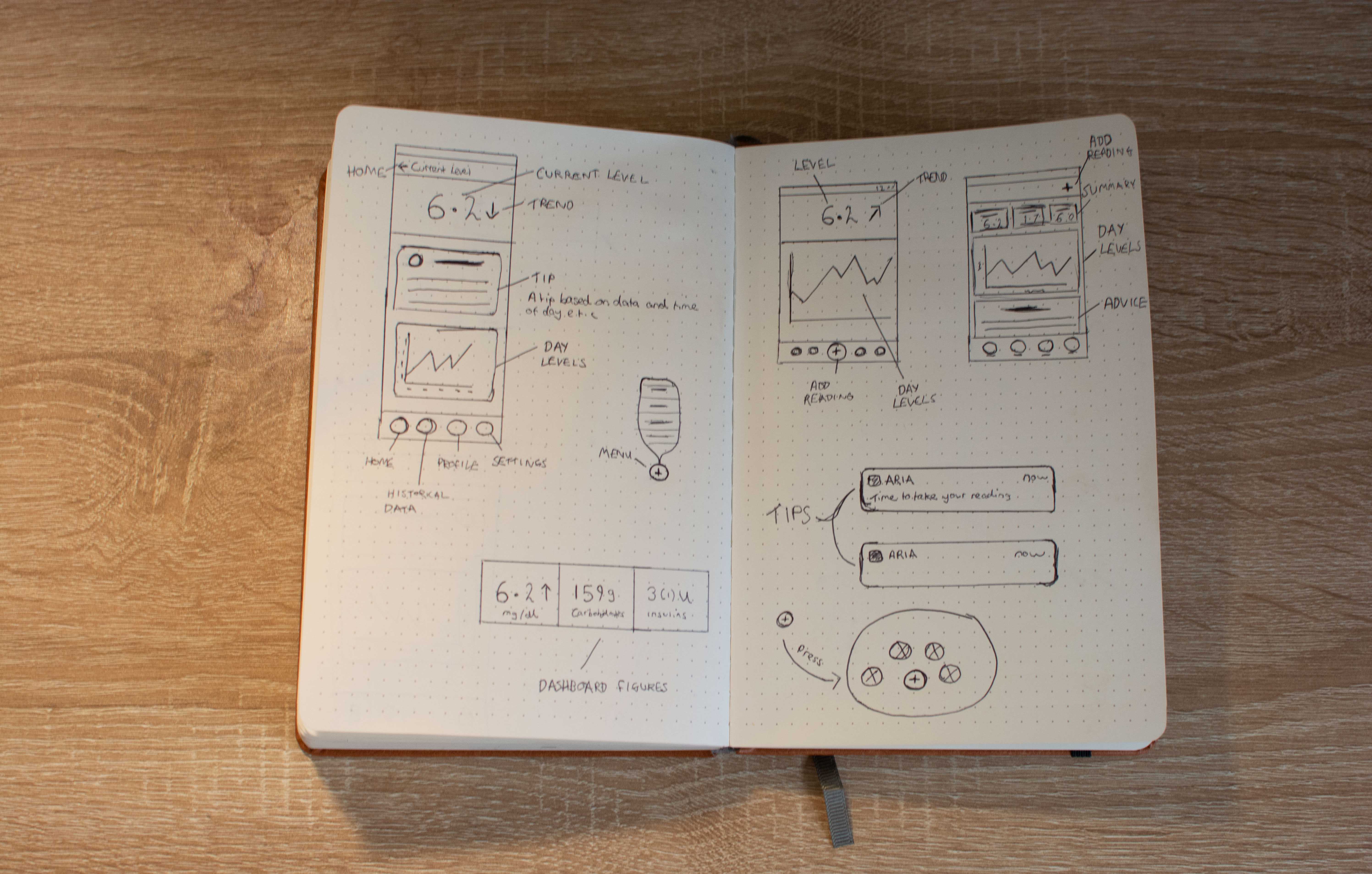
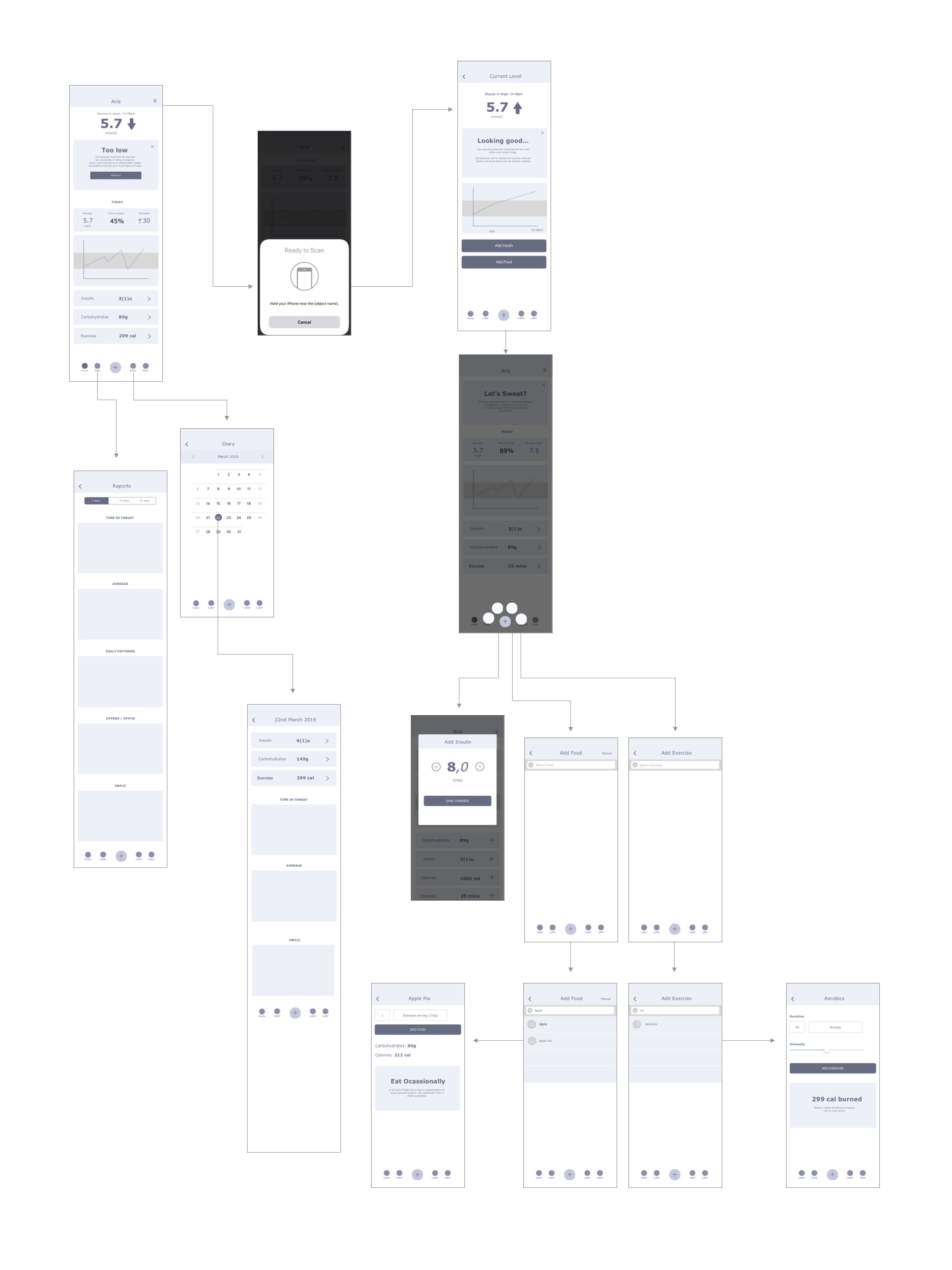
Wireframe Screen Flow
I then designed Wireframes and organised them into the screen flow diagram below. The structure, content and interaction were carefully considered in order to keep the screens minimal but functional and useful. I also considered animation and ensured that it provided context and instant feedback without feeling un-natural or 'stealing the show'.
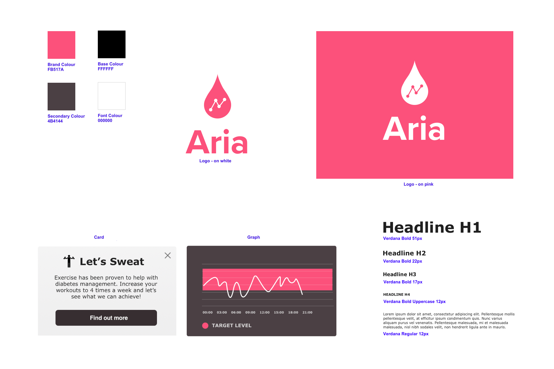
Style Tile
I spent some time considering different branding options and developed a set of colour schemes, logos and typeface choices. The final brand consists of a bright pink and warm grey. The colours were selected to envoke a sense of reassurance as well as to appear modern and fresh. I selected Verdana as the primary font for its simplicity and readablity. I then designed a simplistic vector based logo with a wordmark.
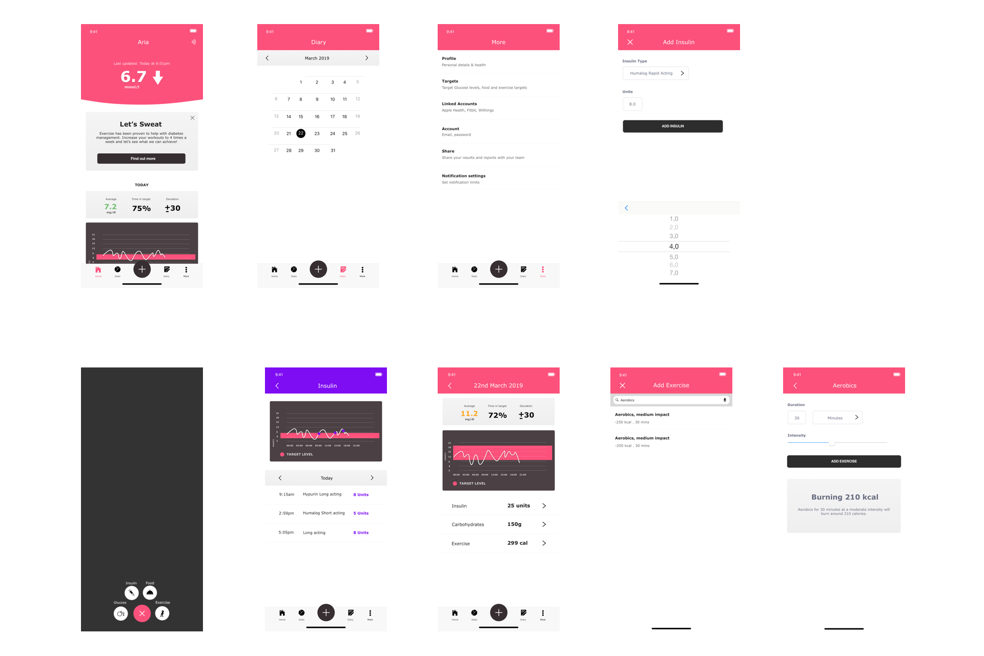
User Interface
With the product and brand defined, I built the low fidelity wireframes into high fidelity UI designs in Sketch. I kept in line in with iOS Human Interface Guidelines as I wanted to ensure the product was as usable as possible. I also considered accessibility as the app could be used by people with a variety of disabilities. This is even more likely in the Diabetes market because the condition is linked to a number of conditions and difficulties including eyesight issues.
Phase 4: Prototyping and testing
Framer Prototype
I built the UI Designs into a Framer X prototype as the prototyping software has powerful animation and interaction features. This would give me the opportunity to focus on animation and interaction.
User Testing
Once I had refined the prototype, I tested it with two diabetics remotely via Zoom and a web hosted copy of the Framer X prototype. I set a number of tasks for the participants to complete and observed as they attempted to carry out those actions. The idea was to validate assumptions and hypothesis that I had made on our potential users and what they needed as diabetics. I discovered the following:
Conclusion
Reflection
Starting this project with only a basic understanding of diabetes has meant that I've been on a journey of discovery. If anything, the management of diabetes is highly inconvenient and innovations often revolve around making the management of the disease easier and less time-consuming. I learnt that data is a crucial part of its management and so to help people with the condition, we need to make gathering and recording the data more convenient and efficient. We also need to make accessing and interpreting the data more accessible too.
Next Steps
As not every diabetic is a coder or mathematician, we should focus on data visualisation in order to represent data in an accessible way for the average person. Further on, an alpha version of the app could be built and used to gather qualitative data from more realistic interactions.